Why Apple Does Not Use Traditional Print Orthography for Traditional Chinese
Opinion as to why Apple uses modern handwritten (Kaiti regular script) orthography for their Traditional Chinese user interfaces since the beginning, with one brief exception.
Notice: This article was originally written in May 2023, however, due to not being published for three years, some content has been updated and edited to reflect my latest views at this time of publishing in May 2026. Any reasoning behind whatever happened is based on my educated guesses and may not be completely true.
This is published some time before WWDC26. While I do not expect any CJK typographical improvements from Apple, I think this will be good timing to explore Apple’s history with CJK typefaces.
Intro
If you are not familiar with what are the different forms of Traditional Chinese, please read this article. The terminology there will be used so as to standardise and clarify things.
The reason why I wrote this opinion piece is because throughout their history, Apple’s Traditional Chinese typefaces did not follow old forms. The only two exceptions, while not strictly old forms, are Lantinghei TC (which has a semi-modern amalgam form, for which has elements of old forms, but it isn’t used as a system interface font), and briefly Heiti TC in Mac OS X Snow Leopard, which was very close to the old forms. But a backlash against the latter forced Apple and Changzhou SinoType to change it to modern forms.
While there is nothing stopping anyone from downloading and using Chinese fonts that follow the old print forms, they cannot be used as interface fonts due to tight control by Apple, which is the reason for the title of this article.
Background
This is quite a long backstory to try and explain why Apple had picked modern handwritten orthography. TL;DR for this section: In the late 1980s to early 1990s, as an American company, maybe Apple did not know better at that time with regard to picking good typography for Chinese locales, and just went with whatever was offered, and later they were recommended the modern forms by DynaComware because at that time, Taiwan and Hong Kong did try to transition away from old forms which were deemed outdated and different from people’s handwriting, and they used the introduction of computers to do so.
So a long time ago, for the bulk of the 20th century, Chinese typesetting was done in metal type, and later followed by phototypesetting machines. With regard to Heiti (analogous to sans serif typefaces) and Mingti/Songti typefaces (analogous to serif typefaces), the glyph shapes during these two eras were mostly the old forms, based on the Kangxi Dictionary forms. They were prevalent for a very long time, seen in newspapers, books, signages and later television.
However, in those days, the handwriting forms (which came from Chinese calligraphic traditions) that people were taught differed greatly from the traditional print forms, therefore leading to confusion about which correct form to use, and eventually governments (and later computer companies) pushed to get rid of the traditional print forms in the name of standardisation and progress.
Mainland China was the first to do so in the 1960s, also because they simplified the characters. However, it was only until the 1980s that Taiwan decided to modernise the Traditional Chinese orthography when computers with primitive bitmap fonts were introduced.1
By the 1990s, Taiwan and Hong Kong did the same when digital type (e.g. TrueType) was introduced.
Taiwan’s bitmap font development and why they chose to modernise their orthography there
When Big5 was being developed in the 1980s, an early version of Taiwan’s educational forms were used as glyph references. They chose Mingti/Songti as a reference, likely because it was used way more than Heiti. That said, the references are slightly different from today’s standard, with Japanese kyōkasho (textbook) forms used as a starting point for their educational standard.2 For example, the 辶 radical initially followed such forms. For the 糹 radical, the top half was still Japanese-kyōkasho influenced, while the bottom half was CN-influenced. 亠 still had JP forms with a vertical stroke, although early bitmap fonts changed this to a dot 丶 stroke.3
Mainland China also had their own separate development of bitmap fonts for computer screens, and they are both Xin Zixing (basically the modern handwritten form for China) and Songti-influenced. Simplified Chinese bitmap fonts throughout computer history followed all that, so I will not go into detail as to why.
In contrast, majority of the print typefaces used at that time were old form orthography and could not be used on computers due to technical impossibility at that time. This was also probably why Taiwan used this opportunity to change their glyph orthography and use educational forms as the basis of digital displays.
Apple’s historical choice for their Traditional Chinese typefaces
With that in mind, details are scarce on how Apple handled Traditional Chinese fonts on their operating systems for the first time. But long story short, it is believed that they had picked forms that are closer to people’s handwriting (楷化), because those forms were the mostly available bitmap fonts at that time.
Let us go through the history of what Chinese fonts looked like, from Classic Mac OS till today.
Classic Mac OS Era
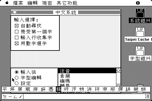
In System 5 (the earliest recorded Traditional Chinese version of macOS)4 the bitmap font’s glyph shapes were closer to educational forms, although there are some minor stroke details that are considered non-standard today. Design wise, it doesn’t look professional.
 Credit: feng270
Later on, around Mac OS 8-9, the first Traditional Chinese TrueType fonts, Apple LiGothic (蘋果儷中黑) and Apple LiSung (蘋果儷細宋), designed by DynaComware, follow modern forms with split strokes. The Taipei pixel font in those versions also apparently follows the modern forms based on Apple LiSung. They have a much improved design and at the same time brought some elements of traditional print orthography (emphasising the split strokes) to the Traditional Chinese user interface, but not wholly.
 Credit: feng270
Early Mac OS X Era
In the early Mac OS X era, Apple LiGothic was the user interface for the Traditional Chinese version. In 10.3 Panther, it was replaced with LiHei Pro (儷黑 Pro),5 which expanded the glyph set for Hong Kong use, and changed some glyph shapes to make it more palatable between Taiwan and Hong Kong.
 Credit: National Taiwan Ocean University
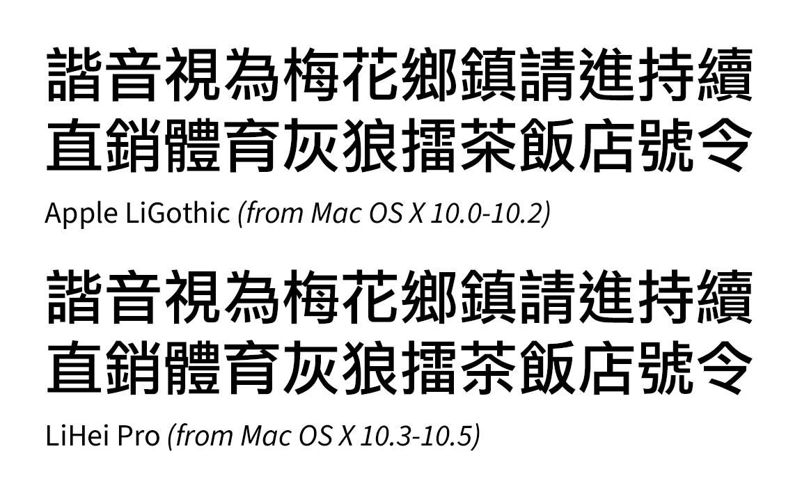
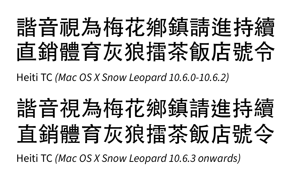
In 2009, when Mac OS X 10.6 Snow Leopard was released, an early version of Heiti TC (黑體-繁, with two weights, designed by Changzhou SinoType) replaced LiHei Pro (which had only one weight).6 This version followed closely to the old printing forms (although with some inconsistencies).7
 Credit: Meow Wang, mobile01 (黑體-繁,其實是個好字型) (Image scaled up for better clarity)
Apparently for the users, seeing those forms was a step backwards in progress. Because they were so used to the glyph shapes of LiHei Pro, they deemed the forms in the original Heiti TC inappropriate. So they complained online and demanded Apple fix the glyph shapes.8 It also led to a creation of a program called TCFail to change the system font back to LiHei Pro (or any other font desired).910
By 10.6.3, the glyph shapes of Heiti TC were changed to modern forms (with split strokes),11 and those people who complained breathed a sigh of relief,12 but the minority who preferred the old forms were indeed very disappointed.13
Late OS X Era
In 2012, with the release of OS X 10.8 Mountain Lion, Apple included Lantinghei (蘭亭黑, designed by FounderType (方正)) as one of the additional bundled optional Chinese fonts. The TC version follows that of the semi-modern amalgam forms. There doesn’t seem to be any complaints though as it isn’t a UI font. Till this day, even on macOS 26 Tahoe, the glyph shapes have not changed.
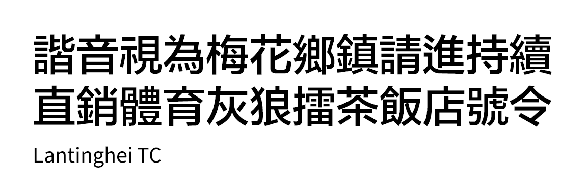
FounderType has since updated Lantinghei TC to follow the Taiwan education forms (it is unclear when it happened and why did they choose to change the forms), however, Apple has not updated the forms. So enjoy the old amalgam forms for a while longer while you still can.
In 2015, with the release of OS X 10.11 El Capitan, Apple introduced a new system font to replace Heiti SC/TC, Pingfang (蘋方), also designed by DynaComware.
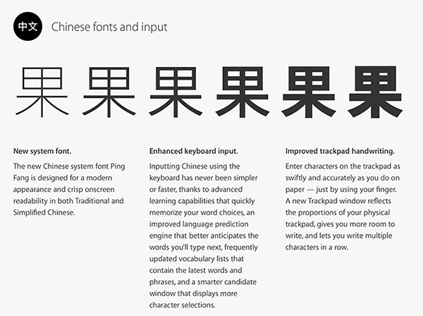 OS X El Capitan’s homepage promoting Pingfang. Ironically, on the English page, the 果 character appears to have been set in the Kozuka Gothic (or Source Han Sans) typeface, when the heaviest weight in the final version of Pingfang at that time is only Semibold, which is nothing like the heaviest weight seen in the picture on the right, but more like third from right. So it was misleading on what the then-upcoming font family would look like. Credit: Chinese Mac
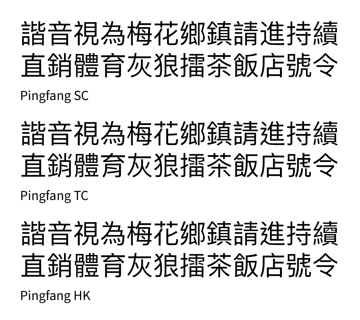
Pingfang TC follows Taiwan educational forms (despite the TC naming which is supposed to represent all regions that use Traditional Chinese, which can lead to confusion), whereas Pingfang HK follows the Hong Kong educational standard, which at least gives those users the more “correct” forms.
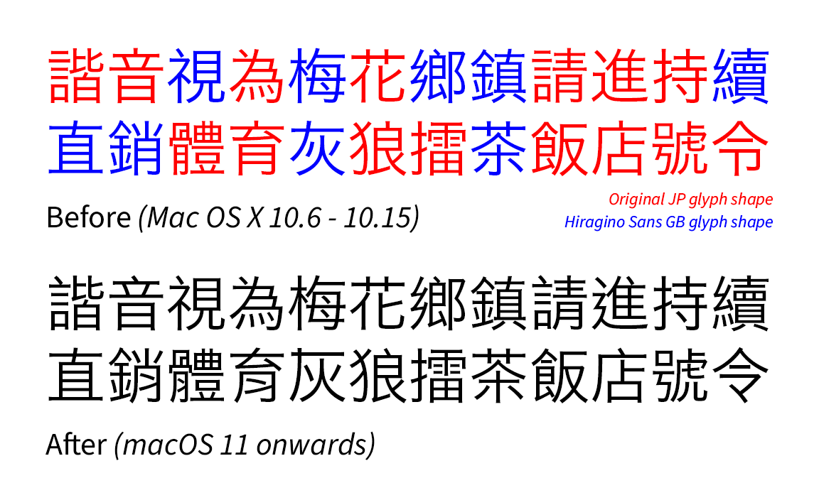
Also related: A sudden change in Hiragino Sans CNS glyph shapes
In the development preview of Mac OS X Snow Leopard, there was an early unfinished version of Hiragino Sans CNS (now called Hiragino Sans TC), which is Hiragino Kaku Gothic (originally designed by Jiyukobo Ltd. and developed by SCREEN) meant for Traditional Chinese. The character set was complete, but the glyph shapes were not standardised. It was not included in the final version of 10.6, until macOS Sierra 10.12 officially included it, still in its unfinished form.
By the looks of it, it was originally planned for the font to roughly adopt the semi-modern amalgam format, as evidenced by a mishmash of Japanese and Simplified Chinese glyphs. In addition, there were some customised glyphs in that orthography format that were not found in the original Japanese font (for which the maximum character set for macOS is Adobe-Japan1-5, and still is), although some of the radical designs weren’t consistent, especially the 辶 and 糸 radicals. It seemed like SCREEN was planning to go for a one-dot 辶 radical (like the original JP version, although U+35FB 㗻 and U+48AD 䢭 is shown with two dots in the below picture) and a LiHei Pro-style 糸 radical, which would technically deviate from the semi-modern amalgam format and go into traditional-handwritten hybrid forms.
 The uniquely-designed semi-modern amalgam forms of the original Hiragino Sans CNS. Credit: 傳承字形之美 Facebook group (I can’t remember the exact post or who the original author is, sorry)
Peculiarly, after being first seen in the development preview version of Mac OS X Snow Leopard, development seemingly stopped for years, until in 2017, when the font was officially finalised,14 but the design direction had completely changed to those resembling Taiwan educational forms (although not fully compliant).
It is unclear why SCREEN had to change direction and who asked them to do it. But given the controversy with Heiti TC as mentioned earlier, it is likely that Apple told SCREEN to halt the development of Hiragino Sans CNS, and asked them to completely redesign the font to not resemble Japanese forms or old print forms. It took quite a while for them to do it.
It was only until macOS 11 Big Sur, in 2020, that Apple finally updated the font. It ended the inconsistency of mixed traditional-handwritten orthography, but it also meant the loss of what could have been: a (somewhat) traditional printing form of Hiragino Sans for Traditional Chinese.
But on Windows, they say MingLiU looks ugly now
Now, I will digress from Apple, so I can talk about why people complained about a particular serif font suddenly looking ugly in Microsoft Windows.
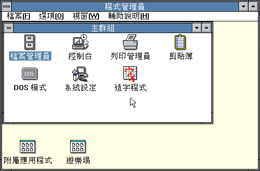
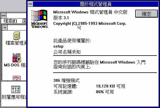
Throughout the 1990s and early 2000s, Windows had their Traditional Chinese user interface font, MingLiU, shown in old forms. However though, Windows 3.0 (released in 1991 for Taiwan) had the bitmap font shown as Taiwan educational forms (albeit an early version which slightly differs from today’s version). Windows 3.1 (released in 1993 for Taiwan) changed the font to old forms for unknown reasons.
 Windows 3.0. Credit: feng270
 Windows 3.1. Credit: Unknown source, via justfont blog
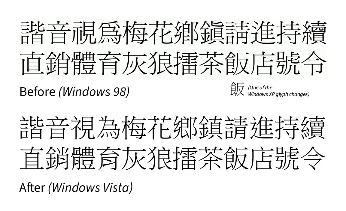
There were some glyph changes to the font in Windows XP. For example, the left 飠 radical was modified into modern Taiwan forms, with the split stroke 𠄌 not being too prominent. Otherwise the font was still mostly based on old forms.
In 2007, around the release of Windows Vista, when MingLiU was updated to educational forms (and was also extended to Windows XP via an update package), people complained about the font suddenly looking ugly.15 But Microsoft refused to change it back, likely because they had to comply to using such forms.
Also, Microsoft Jhenghei (微軟正黑體), released the same year, also followed the educational forms set by Taiwan. It was also the first time sans-serif typefaces were used as user interface fonts for Chinese, whereas previously Ming/Song (serif) typefaces were used, bringing it in line with Japanese/Korean interfaces which, in contrast, have historically used sans serif as their UI fonts, and still do for a good reason.
It is unknown if there were any complaints about Microsoft Jhenghei looking ugly because of such forms. However, by inference, the Hong Kong users are not comfortable with the Taiwan forms and even today, Microsoft never bothered to release a Hong Kong version of Microsoft Jhenghei, likely due to ignorance and cost reasons.
However, recently, as of Windows 11 in 2026, Noto Sans HK (Source Han Sans HK subset) is available as part of the Chinese (Traditional) Supplemental Fonts, an optional feature, but Microsoft has not updated the support page to reflect this.
Maybe the situation was an echo chamber. On the Mac side, it’s modernity and progress, while on the Windows side, it’s traditionalism. However, this is only what I think and people will see this differently, and that view is based on opinions in the mid-2010s.
My take on this
For me, it’s just a bit sad that the dominant forms for Traditional Chinese are the handwriting forms (modern and/or educational) and there is virtually no way to have an option to use the old traditional forms, or at the very least the semi-modern amalgam forms (at least on Mac where modifying system files are not even an option), but that’s the cost of progress and standardisation.
Technically speaking, it’s also because of the 65K glyph limit and Apple’s decision to put Pingfang as one giant CID-based font (it has almost 50K glyphs as of macOS Tahoe), so each locale can simply point to a different CID for a Unicode code-point. If old print forms are to be included (whether it’s an amalgam form, Japanese and/or Korean versions of Pingfang), it would definitely balloon past the glyph limit, and therefore would be technically impossible to achieve without having to split Pingfang into separate fonts, or if a new font format is introduced which will not be backwards compatible with older systems.
Pingfang TC’s naming change suggestion
And finally, Pingfang TC should have been named Pingfang TW (蘋方-臺) from the very start, because as mentioned, the Taiwan glyphs do not represent all regions of Traditional Chinese as there are other regional variants outside of Taiwan.
If such a name change was to be implemented, Pingfang TC instead could possibly be a neutral amalgam form amongst different Traditional Chinese regions. But logistically it would be a nightmare if some websites have to manually change the font name from “Pingfang TC” to “Pingfang TW” in their CSS files if they still want to show the Taiwan forms. In addition, there would be complaints again if Apple changes the glyph shapes to semi-modern amalgam forms for Pingfang TC, even if they keep the Taiwan educational forms and move them into Pingfang TW. That is why I do not believe it will happen, or it could happen in a way it’s still handwriting forms dominant (so the glyph count will not exceed 65K). After all, Pingfang was designed with Xin Zixing in mind.
Conclusion
The cold hard reality is that the majority of Traditional Chinese users would rather see the Chinese that they were taught in school the same as on screens. This partially applies to today’s print and digital media as well. Still, with increasing cross-cultural communication, along with Adobe and Google touting glyph regional differences when promoting their pan-CJK font Source Han Sans/Noto Sans CJK, there has been awareness of other forms that were not taught in school.
But as part of digitalisation, standardisation and modern progress, the traditional print forms are seemingly left to die a slow death as there is no official support for such forms. Only community-led efforts to develop and release open source (and sometimes paid) typefaces keep them from disappearing completely though, ironically thanks to the presence of Japanese (and sometimes Korean Hanja) typefaces, which retain elements of the old print forms especially found in the Pro (and higher according to the Adobe-Japan1 character set) fonts. In addition, older commercial fonts with amalgam forms are still available (although usually only legally obtained via subscription nowadays).
Finally, it is hoped that an operating system (like a Linux distribution) picking a Traditional Chinese font that has semi-modern amalgam forms at the very least can turn things around for a start.
External Links
References
Standard Typefaces for Chinese Characters: Preparation and Promotion - Ministry of Education (via Wayback Machine) ↩︎
Big-5: Computer Chinese Glyph and Character Code Mapping Table, Technical Report C-26, 電腦用中文字型與字碼對照表, 技術通報C-26 - Unicode (in Chinese) ↩︎
Tag: Chinese System - 某廢柴的廢棄日記 (in Chinese) ↩︎
第一篇 Mac 系統 - Mac OS 5.1 (in Chinese) ↩︎
黑體-繁 - Wikipedia (in Chinese) ↩︎
杨维中对华文黑体的另几篇详细声讨文 - Zhihu (in Chinese) ↩︎
Apple, I request you not to use Heiti TC as the system font for Traditional Chinese - Notes on Cocoa ↩︎
TCFail Program (via Wayback Machine, in Chinese, English version here) ↩︎
It was at that time when Mac OS X system files could be modified. Since OS X 10.15 Catalina, Apple has put them in a read-only volume, which effectively cannot be modified by any means. ↩︎
黑體-繁在 Mac OS X 10.6.3 的重大改變 - mobile01 (in Chinese) ↩︎
劣字驅逐正字 - 刻石錄 (opinion piece, via Wayback Machine, in Chinese) ↩︎
SCREEN Makes Hiragino Sans Traditional Chinese Fonts Available for General Release ↩︎
宋體滾蛋,還我細明 - 刻石錄 (opinion piece, via Wayback Machine, in Chinese) ↩︎