The Different Types of Traditional Chinese Orthographies
Do you know that there are multiple writing forms of Traditional Chinese? This article breaks down the types and explains what they are.
Do you know that there are multiple writing forms of traditional Chinese characters?
This summary is basically a quick translation of a Chinese article1 explaining the different types of Chinese forms, so credit where it’s due. However, there is one additional category not mentioned there, which I will explain below.
What are the different orthographies?
- Old forms (otherwise known as the Kangxi Dictionary forms (康熙字典), Jiu Zixing (舊字形) as called in Mainland China or Inherited Glyphs (傳承字形)), and is analogous to Japanese Kyūjitai and Korean Hanja forms. It’s also called traditional print forms, or classic forms. It has largely been the default forms for all of Greater China throughout the 20th century from metal type to phototypesetting.
- Semi-modern (or amalgam) forms, which is popularised by DynaComware and Arphic, and are partially analogous to Japanese Shinjitai forms. There is no unified standard for this, so typeface designers are free to pick which radicals and components will retain the Kangxi forms and which ones will use the modern forms. It is a compromise that has the basic elements of old traditional print forms (e.g. 糹, 言, 辶) while having some components resemble handwriting forms (e.g. 爫, 肖, 尚, 俞), so they would not be too uncomfortable for people to look at.
- There are several degrees of how modern or conservative the orthographies are. For example, in some fonts, the 示(礻), 羽(羽) components retain their old forms, but in others, they follow the Japanese Shinjitai style. Some fonts also retain 直 and 令 components as old forms.
- Modern forms, which is popularised by DynaComware and Monotype HK. Appearance wise, they are closer to the forms that the Chinese people use in handwriting. Some fonts retain elements of the old print forms (like split strokes (e.g. 𠃋 and 𠄌) seen in old forms), while others opt to follow calligraphic tradition of treating split strokes as one continuous stroke.
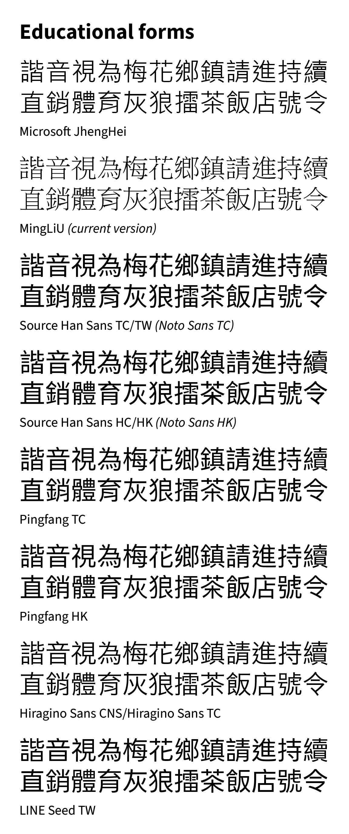
- Education forms, which are mandated by Chinese governments for educational use, but not mandatory for other uses (although they strongly encourage it). Based on the regular script (楷體, Kaiti), transposed onto sans-serif and serif typefaces. There are mainly four official standards: Mainland China, Taiwan, Hong Kong and Macao.
- For China, there is Xin Zixing (新字形, literally New Glyph Shapes), which is based on the 1964 “List of character forms of Common Chinese characters for Publishing” (印刷通用汉字字形表). Xin Zixing even applies to Traditional Chinese characters.
- For Taiwan, there is the Standard Form for National Characters (國家標準字體) by the Taiwanese Ministry of Education (MOE).
- However, between different fonts which I will mention below, there are varying degrees of how much the strokes “comply” with the Taiwan MOE reference, so they’re not “fully compliant” because it’s very difficult to balance out this and typeface aesthetics. This is one point of criticism of this educational form.
- For Hong Kong, it is the List of Graphemes of Commonly-used Chinese Characters (常用字字表) and the Guidelines on Character Glyphs for Chinese Computer Systems (香港電腦漢字字形參考指引).
- I am not fully educated about what Macao uses, but they largely follow HK forms with some exceptions, like 啟 following the TW form.
- For Japan, the equivalent is Kyōkasho forms (教科書), but in commercial fonts, these only apply to Jōyō kanji.
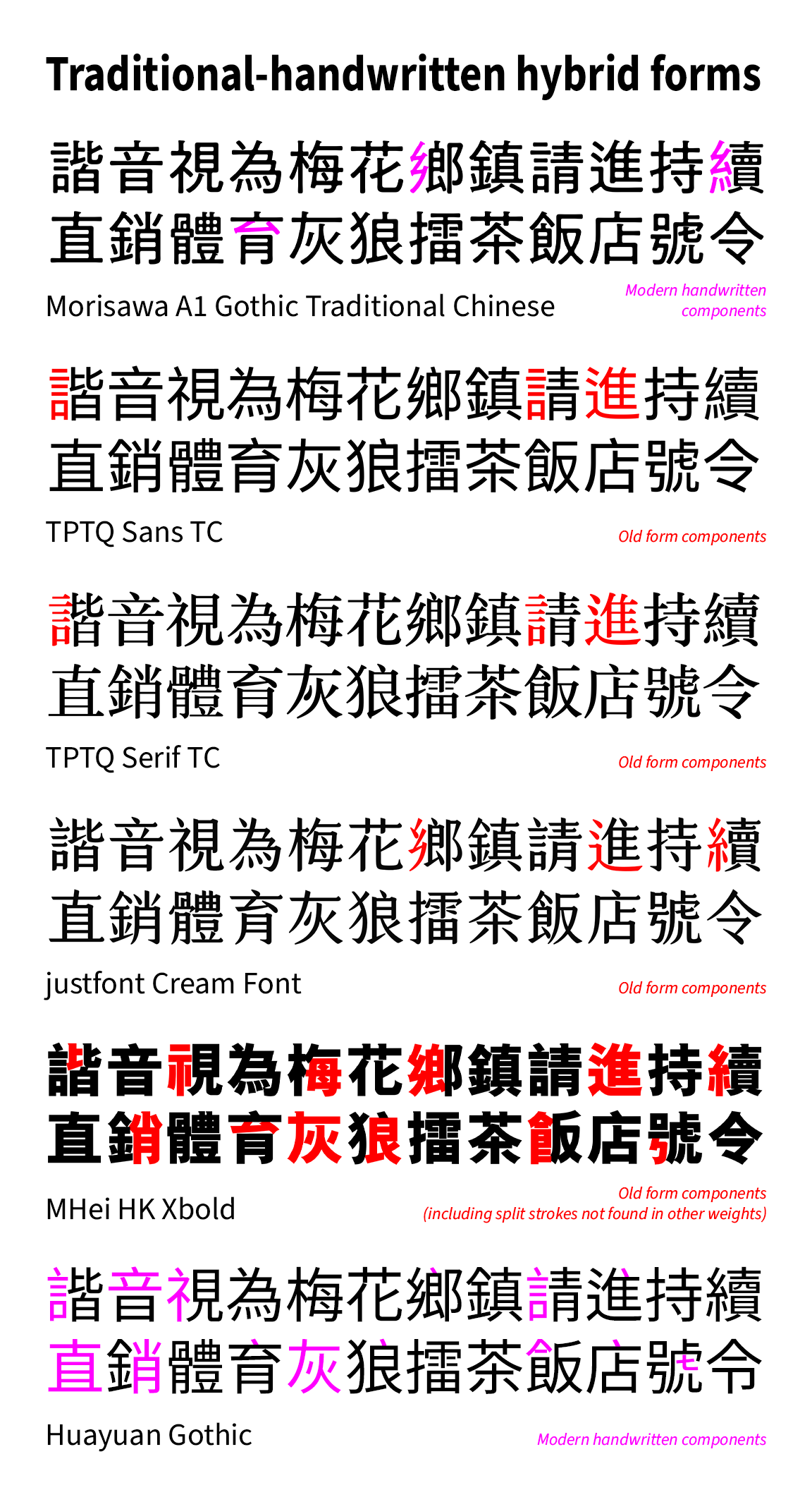
- Traditional-handwritten hybrid forms (or mixed forms) - This is a recent observation that is not mentioned in the original article. Some components or radicals follow Kangxi Dictionary forms and/or Shinjitai-like forms while other components (especially when you expect them to follow traditional forms) follow handwritten forms. I would call it 傳統印刷楷化混合字形 in Chinese.
Examples of these type of forms are given to ensure a better understanding.
Old forms
- The old version of MingLiU (細明體)**, as seen in the Traditional Chinese version of Windows 98.
- The Windows XP version did change some forms, for example, the left 飠 radical to modern TW forms, with the split stroke 𠄌 not being too prominent. Otherwise it is still mostly old forms.
- The early version of Heiti TC (黑體-繁, included in Mac OS X 10.6.0 to 10.6.2)**, designed by Changzhou SinoType (常州华文).
- GenYoGothic and GenYoMincho (源樣黑體/源樣明體)
- Originally based on the Korean version of Source Han Sans/Serif respectively, with some deviations from the Korean standard based on research and practicality.
- Since the v2 release, only the TC version (called 丹) applies, and is also called by GenKiGothic and GenKiMincho (源起黑體/源起明體) with attempts to reduce the Xin Zixing elements from folding strokes where CN/TW/HK glyphs are used, via filter processing.
- Shanggu Sans/Serif (尙古黑體/尙古明體)
- Honourable mention: Chiukong Gothic CL (秋空黑體) where Shanggu took some of its variant glyphs.
- LXGW XiHei/ZhiSong CL (霞鶩晰黑/霞鶩緻宋 CL), based on IPAexGothic and IPAexMincho/IPAmjMincho by TypeBank respectively.
- i.Ming (一點明體), also based on IPAexMincho/IPAmjMincho, expanded to cover most of Traditional Chinese (up to Suppchara, i.Ming’s character list for HK use, not the entire HKSCS character set) and the glyphs modified to be the basis of a standard based on historical Chinese character etymologies rather than on 20th century orthographies. Also a honourable mention here, because this is the first TC font based on IPAmjMincho before LXGW ZhiSong CL.
- Huiwen-HKHei (匯文港黑), based on phototype negative scans of a Heiti font used in Hong Kong in the 1980s-1990s. Original source is claimed to be Iwata Gothic from Japan.
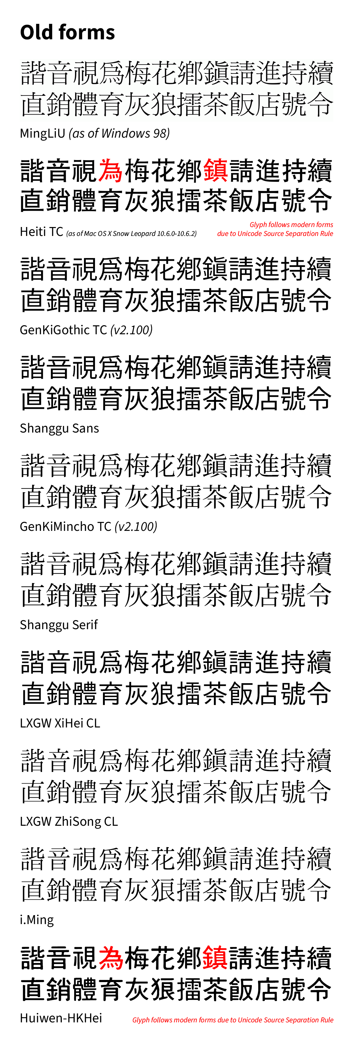
In the case of old forms, the same Unicode codepoints are used to demonstrate most fonts mapping to a glyph that should be in another codepoint, due to Source Separation Rule (e.g. U+70BA 為 vs U+7232 爲). This can be a point of contention as on one hand, modern forms must be used if glyph shapes must be differentiated for technical or academic reasons, and on the other hand, it breaks component consistency since the modern and basic Chinese character sets may not allow for alternate codepoints very easily. In addition, Chinese input methods will always point to the common form first.
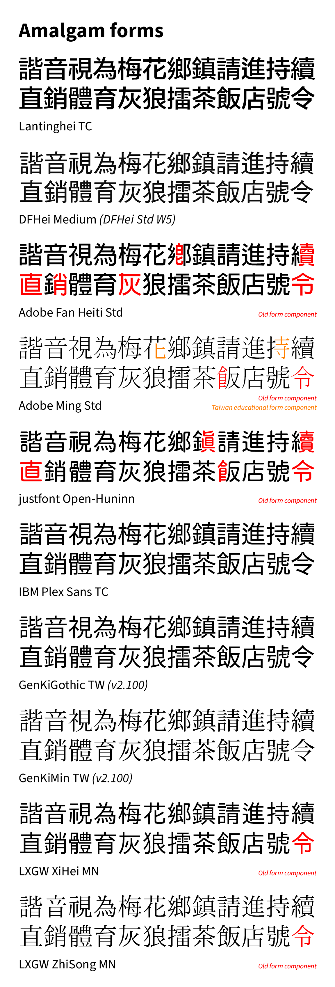
Amalgam forms
- FounderType Lantinghei TC (蘭亭黑-繁)**, bundled with macOS since 10.8 Mountain Lion.
- However, this is the old version, as the latest commercial version on the official website follows educational forms. The old version remains current as of macOS Tahoe.
- Only characters within Big5 follow amalgam forms. HKSCS still follow Xin Zixing forms.
- DFHei Medium (華康中黑體)* from DynaComware.
- Some heavier weights do have some elements of Taiwan educational forms, like 寺 and 感.
- The lightest (華康細黑體, W3) and heaviest weight (華康超特黑體, W14) follow modern forms (with split strokes) with the latter having some elements of Taiwan educational forms.
- Adobe Fan Heiti Std B*, based off AR Hei (文鼎黑體) from Arphic.
- Some components do lean towards old forms, although there are some changes from the original 文鼎黑體, like the 示 radical turning into 礻, and the first stroke of 音 changed from the original horizontal stroke (which is closer to Inherited Glyphs form) to a vertical stroke for the Adobe version.
- Adobe Ming Std L*, based off AR Ming (文鼎明體) from Arphic.
- Open-Huninn (jf open 粉圓) by justfont, based on a Japanese font called Kosugi Maru by Motoya.
- A good amount of components like 真(眞), 直, 飠(𩙿) and 令 lean towards old forms, while the 戶 component (except for the base character) is designed as 戸, likely due to a stylistic choice influenced by Japan.
- IBM Plex Sans TC
- GenYoGothic and GenYoMincho (源樣黑體/源樣明體) v2, TW version (called 月).
- To achieve the amalgam look quickly, a lot of CN/TW/HK glyphs are used directly, with attempts to reduce the Xin Zixing elements from folding strokes where such glyphs are used, via filter processing (as mentioned earlier).
- LXGW XiHei/ZhiSong MN (霞鶩晰黑/霞鶩緻宋 MN)
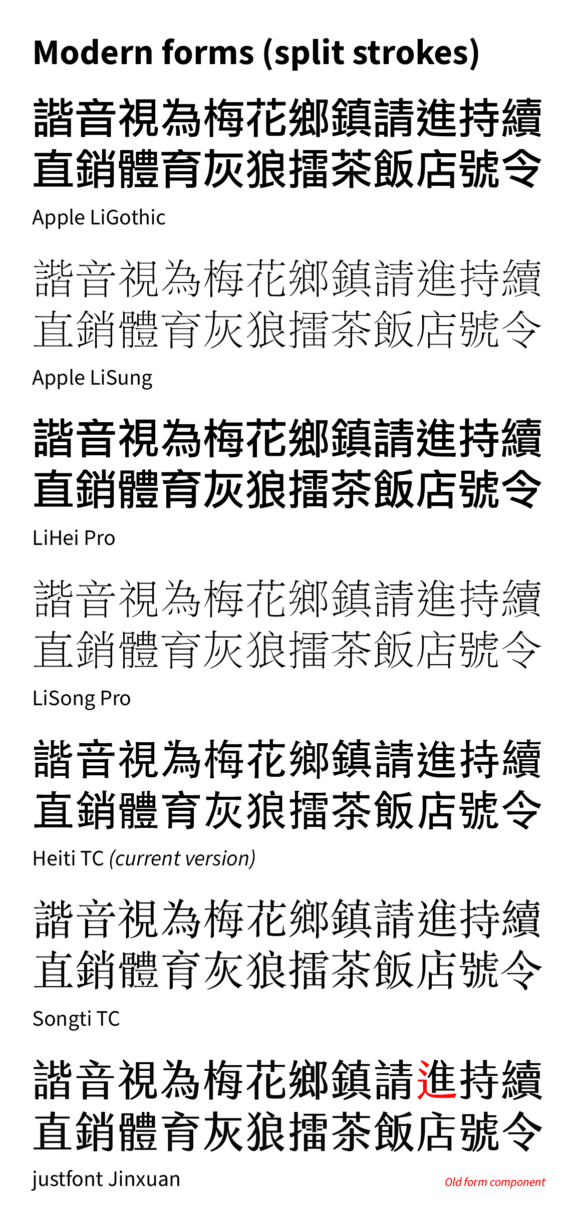
Modern forms (split strokes)
- Apple LiGothic (蘋果儷中黑)** and Apple LiSung (蘋果儷細宋)** by DynaComware.
- LiHei Pro (儷黑Pro)** and LiSong Pro (儷宋Pro)** by DynaComware.
- The finalised version of Heiti TC (黑體-繁)** by Changzhou SinoType.
- Songti TC (宋體-繁)** by Changzhou Sinotype.
- justfont Jinxuan (jf 金萱)*, except for the 辶 radical which follows old forms, and I wasn’t completely sure if this should fall under the Traditional-handwritten hybrid forms category.
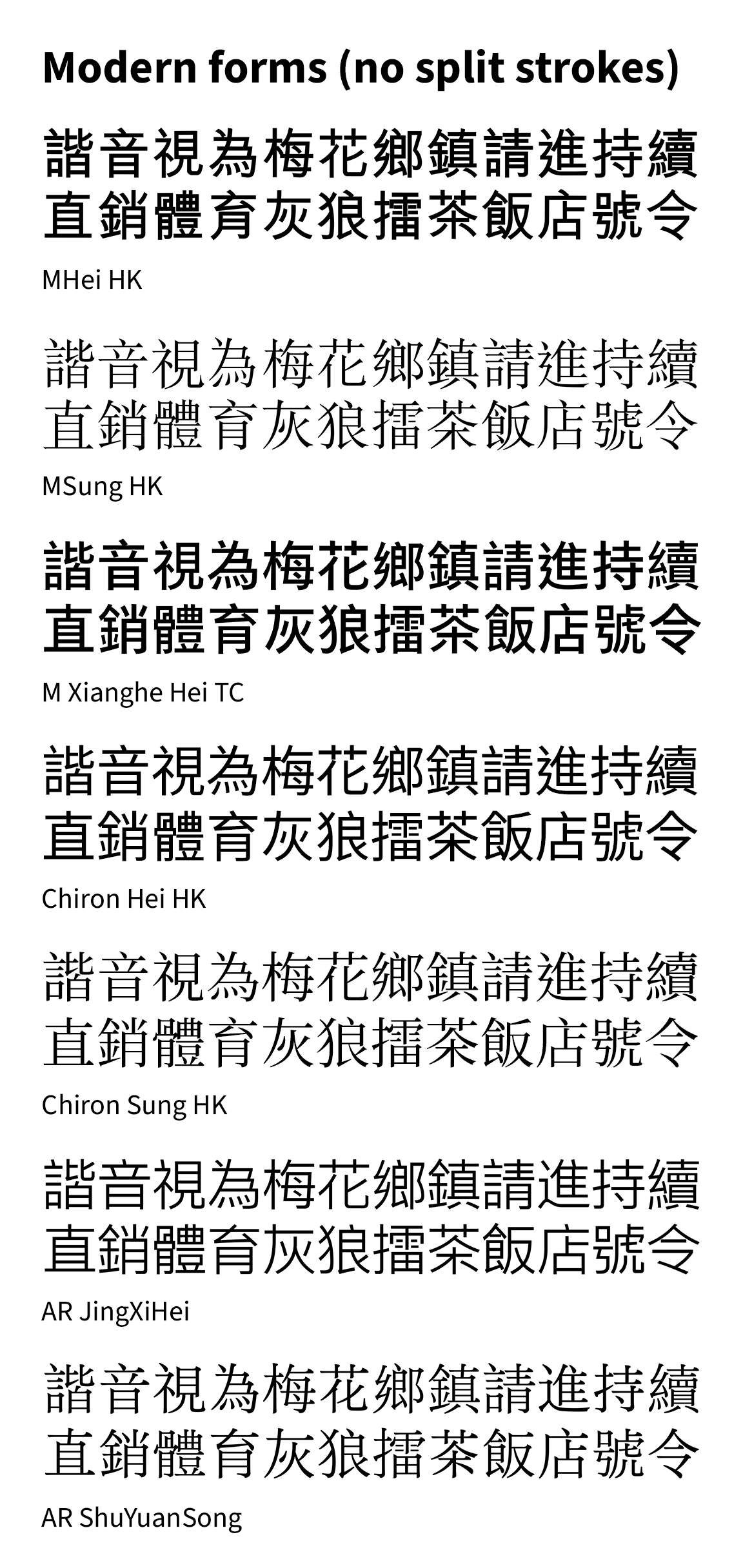
Modern forms (no split strokes)
- MHei HK* by Monotype HK.
- Except for the heaviest weight Xbold which falls under hybrid forms due to a good amount of the components being close to old forms, explained below, while the lightest weight Light has split strokes.
- MSung HK* by Monotype HK.
- XiangHe Hei TC (翔鶴黑體)* by Monotype.
- Chiron Hei/Sung HK (昭源黑體/昭源宋體), based on Source Han Sans/Serif respectively.
- AR UD JingXiHei (文鼎UD晶熙黑體)*; while some forms, like the 辶 radical, resemble those used in Mainland China, some components like 骨 do not follow the PRC standard.
- AR ShuYuanSong (文鼎書苑宋)*; ditto.
Educational forms
- Microsoft JhengHei (微軟正黑體)**
- The current version of MingLiU** since Windows Vista.
- Source Han Sans/Serif TC (Taiwan) and HC (Hong Kong) by Adobe and Google, with font designers Changzhou SinoType and more recently Arphic.
- Pingfang TC/HK/MO (蘋方-繁/蘋方-港/蘋方-澳)**, based on King Gothic (華康金剛黑)* by DynaComware. MO is not listed in the example picture since they largely follow HK with very few exceptions.
- Hiragino Sans TC (formerly Hiragino Sans CNS, although not strictly)** since macOS Big Sur, designed by SCREEN (a Japanese company).
- LINE Seed TW, originally designed by Fontworks (at least for the ideographs, as LINE Seed JP), then extended to Traditional Chinese by DynaComware, and modified into mostly educational forms.
- However, it is not fully educational forms, because there is a press stroke 乀 instead of what’s supposed to be the dot stroke 丶 in components like 八, 六, 貝, 大, 吳, 美, due to inheriting the design choice from LINE Seed JP, and the meat 肉月 radical is not Taiwan MOE style.
Traditional-handwritten hybrid forms
- Morisawa A1 Gothic Traditional Chinese*; most components fall under semi-modern amalgam forms, except the 厶 and 糹 components follow modern handwritten forms.
- Typotheque TPTQ Sans/Serif CJK Traditional Chinese*; most components fall under modern forms (no split strokes), except the 言, 辶 and 隹 components follow Kangxi forms.
- justfont Cream Font (凝書體)*; some elements adopt Taiwan forms (but not the 肉月 radical), while others follow Kangxi forms (for example, 糹 and 辶 radicals), and folding strokes like 𠃋 and 𠄌 have split strokes. The font website even states that it blends Kaiti elements with Mingti. However, the Japanese version fully complies with Japanese orthography, which leans closer to traditional printed forms.
- MHei HK XBold*; An older example, with idiosyncratic features like half of the components belonging to old forms while other components like 令, 言 and 亠 have handwritten forms. Even the simplified PRC version has elements of old forms as seen in the 纟 radical.
- Huayuan Gothic (樺源黑體) - The only free and open source font I can find that is of this format, based on Source Han Sans and Chiron Hei HK. No longer maintained since 2022.
* Paid commercial typeface
** Commercial typeface bundled with an operating system (like Mac/Windows)
Closing words
On Chinese-language social media, especially in the 2010s, there has been a lot of debate on which orthography is better. I will not go into detail, but in general, some people wholly prefer educational forms because they think it’s the correct forms as taught in school, and that the traditional orthography forms are considered incorrect, outdated or Japanese. One even said it was “humanist”. On the other hand, some people prefer traditional forms because it’s more aesthetically pleasing in terms of structure, composition and the sense of symmetry, and handwritten forms (especially the Taiwan Educational standard) ruin these qualities2.
I am not saying that one form or the other is bad, I just want to objectively explain what those forms are, so people can have a better understanding of why are there actually multiple forms of Traditional Chinese, and how they have evolved over the years. Anyone is free to pick what Chinese orthography suits them the most.
With that, I will explain why one of the popular operating systems had never even used traditional forms for their Traditional Chinese UI (with one brief exception). Stay tuned for this post.
I will also cover what I know about Japanese character sets despite my limited knowledge in a future post.
Legal disclaimer
Some of the commercial typefaces displayed in the pictures are copyrighted. They are only used to demonstrate the glyph orthographies and therefore fall under fair use. Any other use requires a commercial licence.