Apple and Microsoft Should Unify the Look of Their CJK Fonts
Opinion as to why Apple and Microsoft’s CJK user interfaces are still inconsistent even in 2026, because of different CJK fonts and Unicode.
Notice: This article was originally written in July 2023, however, due to not being published for three years, some content has been updated and edited to reflect my latest views at this time of publishing in June 2026. Any speculation and reasoning behind what happened is based on my educated guesses and may not be completely true.
Preface
In this article, the history of separately designed and developed CJK typefaces for different locales, and the use of multi-language tags in the same page on the Internet make Chinese characters look inconsistent across different languages, which to some people like me, can look jarring. Therefore, Apple and Microsoft should unify their CJK typefaces with a consistent look, similar to what Adobe and Google did for Source Han Sans.
Background
I’m not going into details about Chinese character history, but basically Chinese characters (漢字, hanzi) is one of the oldest writing systems for at least three millennia, and they eventually spread to Japan (kanji) and Korea (hanja), for which they had their own developments separate from China.
In the case of South Korea, Hangul is the dominant script in modern times, but basic system fonts support Hanja. For the sake of this article, the Hanja script is used for comparison with the Chinese and Japanese locales.
Fast forward to a time before Unicode (around the 1990s), computer operating systems sold in Asia, like Microsoft Windows and Apple’s System 7, had different fonts tailored for their different languages. In addition, the countries’ encoding systems to display their languages were totally separate and incompatible with each other.
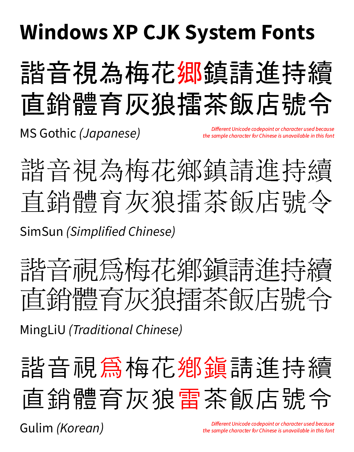 In the good old Windows XP days (and earlier), from top to bottom, default language order: MS Gothic for Japan, designed by Ryobi Imagics Company Limited; SimSun for Simplified Chinese, designed by Beijing ZhongYi Electronics Company; MingLiU for Traditional Chinese (note the old forms used back then, except for 飯), designed by DynaComware; and Gulim for Korean, designed by HanYang. Notice that the Chinese fonts at that time were of the Ming typeface (analogous to serif), which was inconsistent with the sans-serif used in Japanese and Korean interfaces.
At that time, because there was no Unicode, it was mostly expected that only one language be seen and used in a particular region, so having different fonts for different languages was a non-issue, and rather a cost-efficient method for the time.
Then, when the Internet spread and Unicode became the standard, Apple and Microsoft eventually included all those different fonts to facilitate multilingual use. Maybe websites at that time did not use language tagging for specific texts, but they could specify a language-appropriate font in CSS if they want to display the correct language, so it could occur on the entire webpage, so displaying Chinese characters with one font style (if set correctly) was still not a problem.
But I might be wrong on this, because actually, there are two problems with how Unicode CJK text are handled.
The problem with Unihan and the different CJK fonts
There are problems with Unicode and how they treated encoding Chinese characters in the beginning, but I will explain in further detail about this in a future article. Basically it boils down to this:
The first problem: Once Unicode web pages became common, without language tagging for CJK text, the operating system (OS) determines the language order for which font goes first. The wrong use of language order will lead to a Chinese passage showing two or more fonts.
Historically, in the late-1990s to early-2000s, the Japanese language took priority in computer operating systems due to Japan being a more significant market for the Western technology companies than China and Korea.
Because of this, for Simplified Chinese text, the two font problem is more obvious. Japanese glyphs showed first, then when a Simplified Chinese character appeared, it appeared in a different font (because the Japanese font doesn’t support the Simplified Chinese character). In rare cases, there will be boxes (☐, or tofu as some would like to call it) because there is no Simplified Chinese font installed at all.
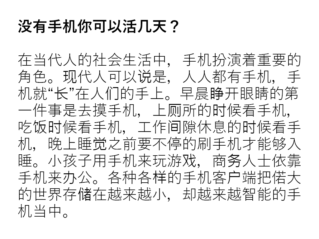 An example of a Simplified Chinese text rendered under the Windows default language order, which is Japanese first, followed by Traditional Chinese (Taiwan). Characters like 们, 长, and 务 are rendered in a different font (which may or may not be obvious), because the Japanese font does not support these characters, while other characters like 睛, 所 and 才 which can be rendered in the Japanese font are presented in an orthography which can be unfamiliar to primarily Simplified Chinese users (戸 vs 戶; 円 vs 月). Nowadays, Chromium browsers render Simplified Chinese first though. Text credit: hskreading.com
The second problem: The use of language tags in websites like Wikipedia for short text passages means appropriate forms for Chinese characters will show up in mixed-language environments. A side effect is that Chinese characters now look inconsistent, and if one knows fonts well, it is easy to tell Japanese from Chinese just by looking at the font.
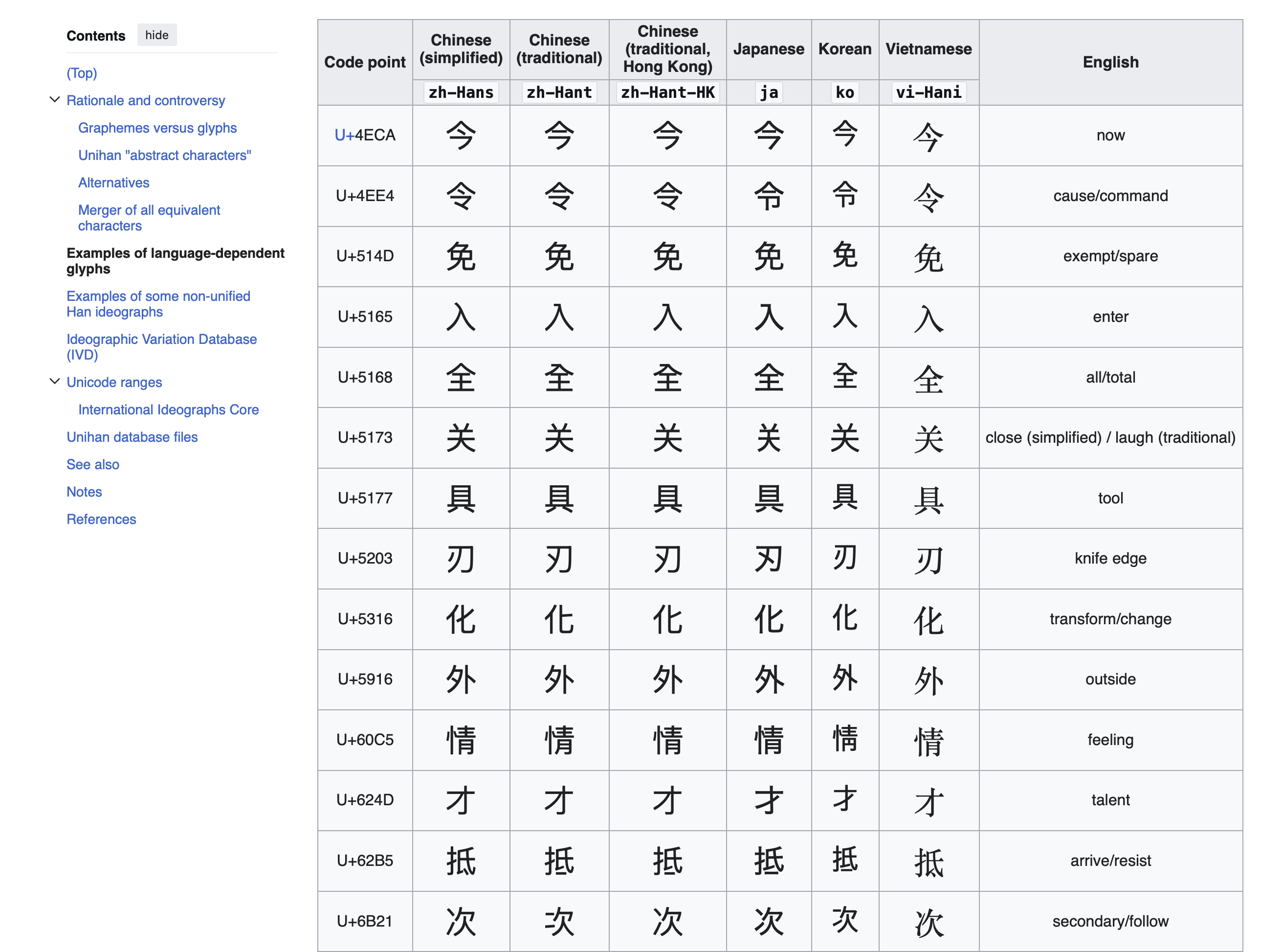 The English Wikipedia Han unification article showing the different-looking macOS CJK system fonts being used for different regions (A Vietnamese font with Chinese characters is not installed, because Chinese characters are not practically used there, so there is a fallback to the Chinese Songti font). Website content is under CC-BY-SA 4.0, so the image will be licensed as such.
It’s not just because the fonts have to cater to their respective national standards, and designed based on the common print typefaces used in their respective regions at that time, but also the font vendors have their own interpretations of how the Chinese characters should look like on screens.
The OS CJK font inconsistency
Microsoft is the worst offender of this subject
In 2007, with Windows Vista, Microsoft introduced their new sans-serif UI fonts for Asian regions which are:
- Microsoft YaHei for Simplified Chinese, designed by Beijing Founder Electronics
- Microsoft JhengHei for Traditional Chinese (Taiwan only), designed by China Type Design Limited
- Meiryo for Japanese, designed by C&G Inc.
- Malgun Gothic for Korean, Hangul designed by Sandoll, although Hanja was only added in Windows 8, apparently designed by China Type Design Limited and Monotype (needs source)
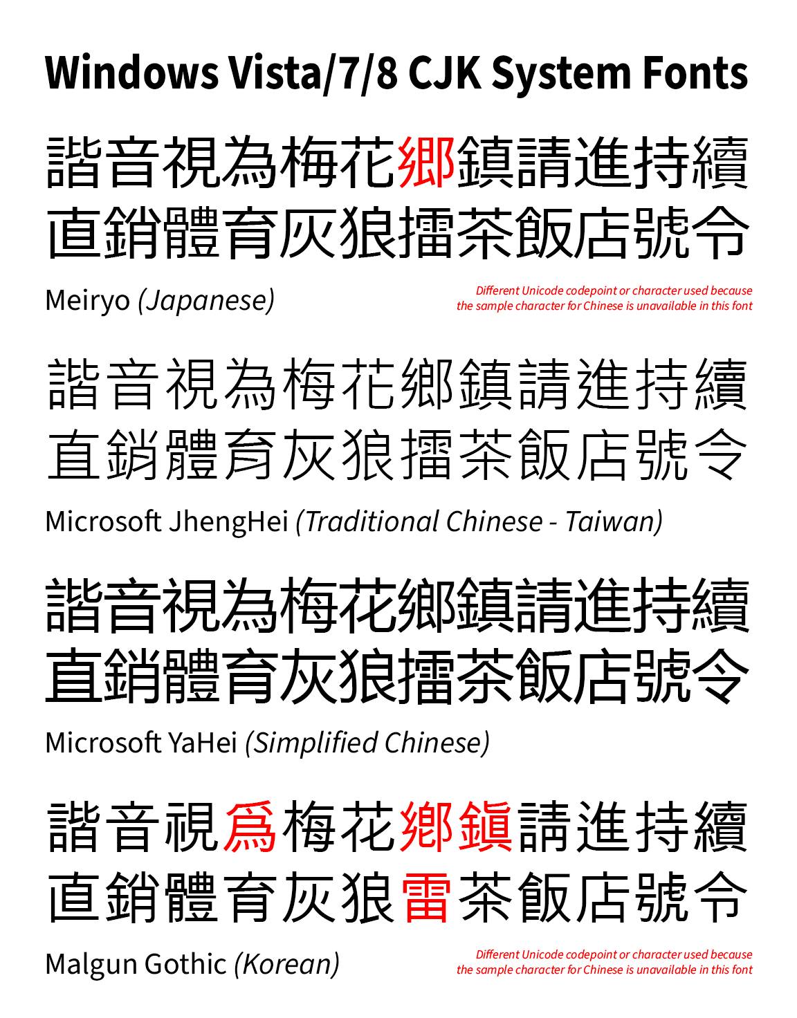 The Windows Vista/7/8 system fonts, in the default language order. Note that Hanja for Malgun Gothic only showed up in Windows 8 and later, but it is put there for comparison.
Unfortunately all those fonts are designed completely different with no regards to how they would look when used together. Microsoft Jhenghei in particular has a thinner weight than Microsoft YaHei and Meiryo, for what’s supposed to be a regular weight.
Ultimately the different designs of the Chinese characters show up like a sore thumb when used under mixed-language environments, potentially distracting users from actually focusing on the content.
If this is what Microsoft intended all along so as to make sure the languages are clearly distinguished when looking at CJK text, then it’s a grave mistake in aesthetics and they seriously must reconsider it.
Well they tried a bit to fix something…
Project Noble Scarlet12 was an attempt to improve the Chinese typeface and actually unify the look across Simplified Chinese, Traditional Chinese and Japanese, but for unknown reasons (likely cost and issues with low resolution displays), it was likely abandoned, perhaps canned by Microsoft executives. As of Windows 11, they still have the same-looking Microsoft YaHei as Windows Vista, and the font problem was never solved.
Apple needs to put in more effort if they care about type design
Apple is known for attention to detail when designing their operating system. Steve Jobs even cared about putting high quality fonts onto the Macintosh so that it feels easier and friendlier to the average user.
However, like Microsoft and all other computer companies, when they initially had to source their fonts for CJK locales, they had to use local font vendors, which obviously made different looking fonts depending on locale.
In the early Mac OS X era (let us take 10.5 Leopard as an example), in order of default language order:
- Hiragino Kaku Gothic, designed by Jiyukobo Ltd., for Japanese
- STHeiti, designed by Changzhou SinoType, for Simplified Chinese
- LiHei Pro, designed by DynaComware, for Traditional Chinese
- AppleGothic, apparently designed by Choi Jeong-Ho (needs better source),3 for Korean
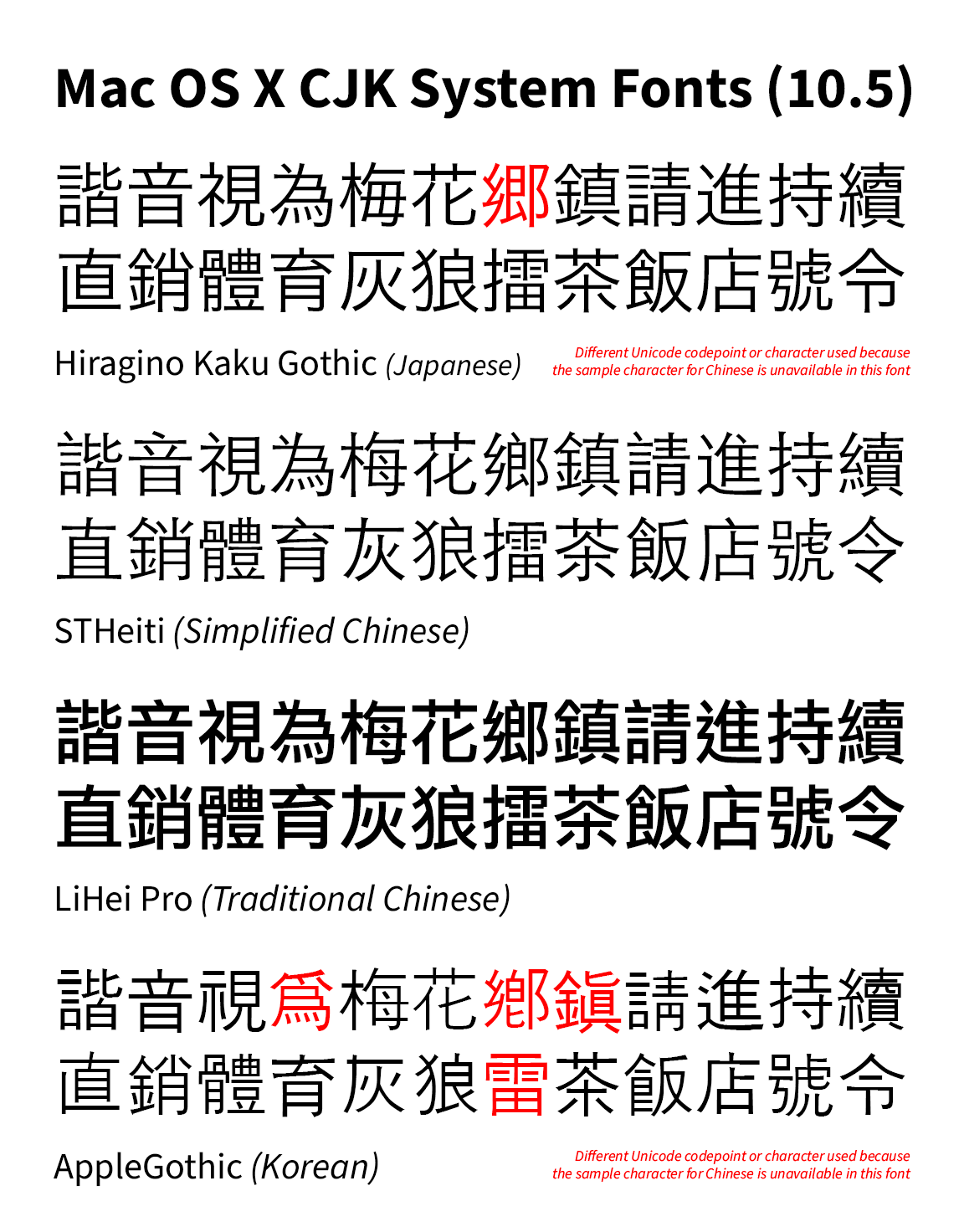
These fonts look wildly different when placed together. As with Windows, it became a problem when in the default language order for any non-CJK locale, Japanese was above Simplified Chinese (until sometime around the mid-2010s when the reverse happened, I cannot recall exactly when this happened, probably 10.10 Yosemite or 10.11 El Capitan?).
In 2015, with the release of OS X 10.11 El Capitan, Apple introduced Pingfang (based off King Gothic by Dynacomware) to unify the look of Chinese characters while keeping regional differences between Mainland China, Taiwan and Hong Kong. However, it only stopped at Chinese, as Japanese and Korean are left untouched; because for the latter, as mentioned earlier, Chinese characters are not used much. As for the former, I believe the Japanese still want Hiragino as their UI font, due to how well it works on screens, so they would not want another font to keep things looking familiar and not to break things.
Later, as of macOS 15 Sequoia and iOS 18, for Japanese, W4 is now used as the default weight for Hiragino Sans instead of W3, which is intended to reduce the perceived inconsistency when being used alongside Chinese fonts, however, it does not fundamentally solve the different typeface design problem.
This is the current system fonts as of macOS 26 Tahoe.
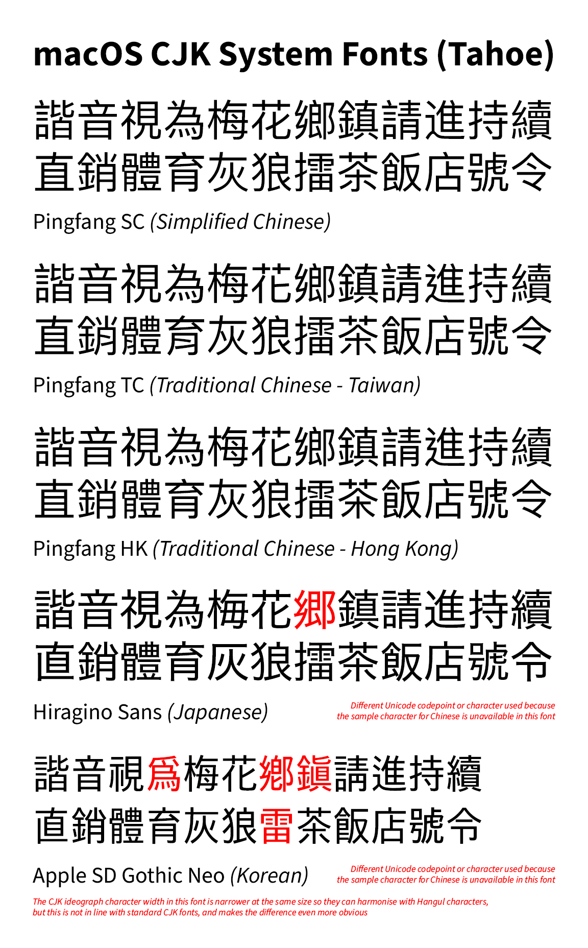 macOS 26 Tahoe system fonts. While arguably better than Windows, there is still some typeface distinction between Chinese, Japanese and Korean.
Any workarounds to this font inconsistency?
One way is to use custom fonts in the web browser. A potential downside is that it may not be good for privacy when using them on the Internet, because of fingerprinting technology that websites use to profile a user.
There are workarounds to change the system font, however, I’m not going into details about that due to my lack of experience. Unfortunately for Mac, it cannot be done due to System Integrity Protection and since macOS Catalina, a read-only System volume due to “security reasons”.
For Firefox, you can actually use custom fonts for different languages. However, on Windows, the custom fonts may not have hinting applied so it will look a bit blurry on non-retina screens, unless they already have hinting applied. This is a potential downside to using custom fonts.
However, for Chromium-based browsers, I am unable to find a proper solution for that, so you’re stuck with default fonts. Even extensions that claim to change the font based on language do not work on my end at the time of this writing.
I do not know of any other solution as of this time, but I will update this article if a solution can be found.
Conclusion
This idea may seem far-fetched, but with lots of money, there is simply no excuse for big tech companies to continue to allow different-looking fonts for Chinese characters.
A minor downside of font unification is that it won’t be easy to tell what font is used for what language at small sizes, but given that typeface design should be consistent to ensure the content can be the focus, I think it’s worth the tradeoff.
And finally, if let’s say there’s a new typeface that can unify the look across different East Asian locales, Traditional Chinese should include a neutral region with neutral glyphs, not just educational forms from a particular region, and maybe this should be the default for anything that isn’t language-tagged, but that, again, is another story.
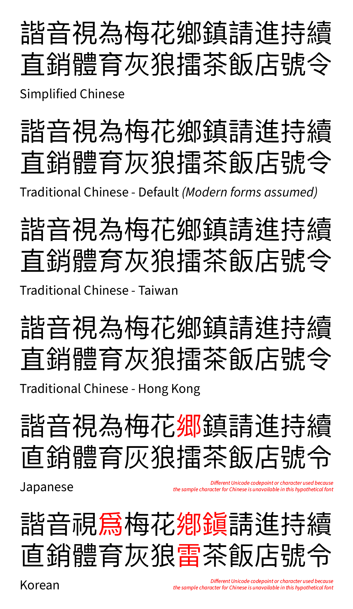 What if… a unified Pingfang CJK font for all CJK locales
References
新版微軟雅黑,以及在 Windows 上優化中文顯示的多種技巧 - Ian Y.E. Pan (in Chinese) ↩︎
如何评价 Windows 10 17025 测试版开始出现的「新版微软雅黑」? - 知乎 (in Chinese) ↩︎
AppleGothic - NamuWiki (Machine translated version, originally in Korean) ↩︎